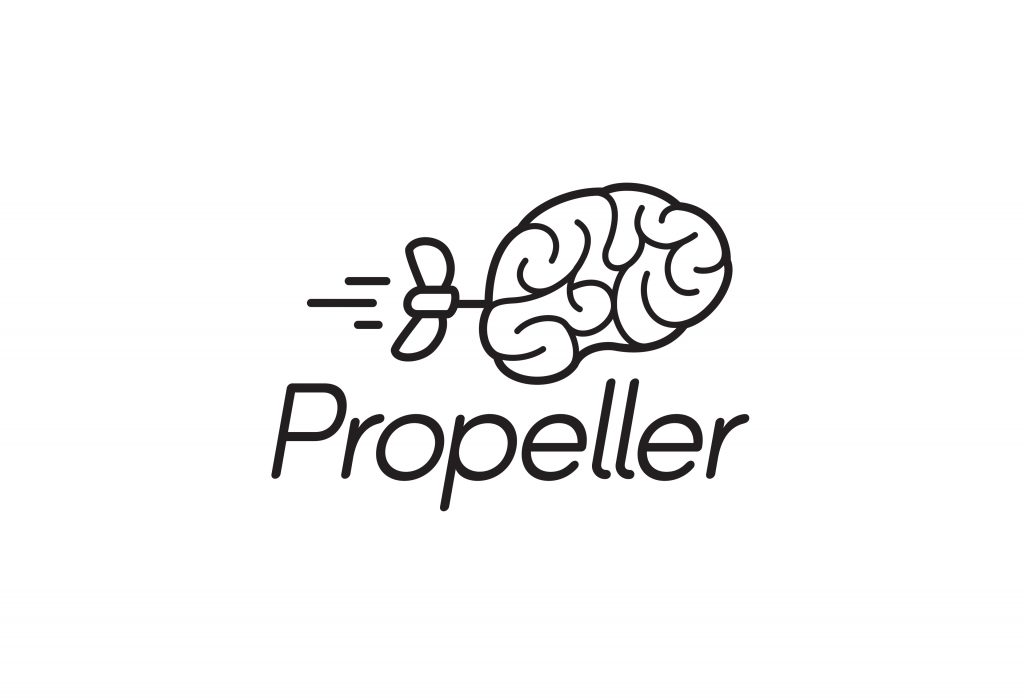
When it comes to educational supplies and resources, Propeller, formally Eastpoint, really knows it stuff. But they had a big ambition to become a household name and needed a new brand and identity to take them to the top.
PROPELLING EXPERTISE
Our proposition, ‘Powering the Icon’, brought the desire to go behind the scenes to the forefront. Once again people can step inside the iconic turbine halls and get up close and personal with the brands they love.
ADDING SOME THRUST
To deliver on the brand promise; ‘taking education further’ the identity was injected with life using a playful iconographic propeller. The propeller adds the thrust and energy to the identity that the brands learning solutions provide to teachers.
A unique set of custom icons was developed to communicate subjects as well as wider themes and project on offer – but with each taking two states; ‘normal’ and ‘propelled’.
The playful aspect allows the icons to become an easy to fun assets to use across the brand for teaching staff and kids alike.
The playful identity extended into new and innovative educational exercises, such as ‘idea shouts’ and ‘star magnets’. Each a new and unique vernacular to Propeller.
A suite of textural expressions helps to emphasise the brands passion and creativity – setting the brand apart from anything in the sector.
The brand launched at The Education Show in Birmingham to a crowd of 10,000 education specialist from across the world. Teachers and children found the brand fun and engaging, leaving them confident that they had found a trusted education partner.
While at
Elmwood
Project Team
David Lismer, Kyle Whybrow & David Jenkinson.
Awards
Graphis Branding 7: Silver
Next Project
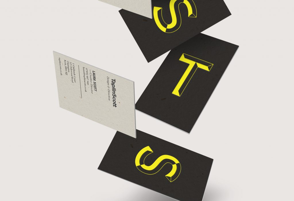
TaplinScott Creating a brand that beautifully balances trust and moments of surprise.