loader-logo

CAFFÈ TROPEA

Bringing the spirit and passion of Tropea, Italy, to a quaint cafe sitting in the heart of Russell Square.

STRATEGY / IDENTITY / ILLUSTRATION / PHOTOGRAPHY / INTERIORS / PACKAGING / WEBSITE

TropeaPhotoEspressoCup1

Since 1981, the charming cafe sitting in the middle of one of London’s finest square has been home to a vibrant and passionate family who relocated straight out of the heart of southern Italy.

We were asked by the family to create a name, brand identity and brand experience that would allow the family business to expand to other sites and would work across their range of roasted coffee beans and products.

TropeaPhotoRussellSquare1

After thirty years in the business, owner Paul was ready to let his beloved Caffè Russell be run by the next generation, his son, Giovanni.

With the handover of responsibility, there was an opportunity for Giovanni to put his own stamp on the family business and create a brand and an experience that expressed his vision for the future.

TropeaLogoFlat1

Caffè Tropea was born, a unique destination that feels like a welcoming family kitchen and where newcomers feel like old friends; a brand imbued with honest Italian passion.

Whether you stay for 2 minutes or 2 hours, you’ll be part of something truly authentic.

TropeaPhotoHotDrinks1
TropeaPhotoGiovanni1

Fusing together the elegance of Bloomsbury with the flair and warmth of this Italian family was key in bringing these two worlds together.

Through a series of client workshops and design team working sessions we unfolded the brand narrative and strategy to reveal the family’s authentic story and experience proposition.

TropeaMap1
TropeaWorkshop1
TropeaStrategy1

If you popped down to Caffè Tropea today, you’d be instantly captivated by one of Giovanni’s, or his father’s, stories. It’s this storytelling that is at the heart of the cafe’s spirit and what we wanted the brand expression to bring to life.

TropeaTIllustration1

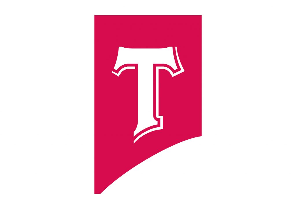
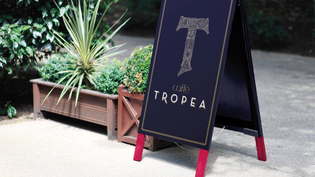
Giovanni came to the table a very clear design request – ‘design me a crest’ – something that tells our story.

We set about sketching a wealth of concepts that brought this Italian family story too life in a crest form.

Our final concept deviated away from the expected shield shaped crests, that are ten to the dozen, and took the form of the T of Tropea.

Not only was it clear and simpleminded, the form subtly referenced the shape of Italy with its famous Calabria kicking foot.

TropeaSketch3
TropeaSketch1A
TropeaSketch2
TropeaCup1
Print
TropeaJordanSketch2

We enlisted the detailed and elegant craftmanship of Jordan Metcalf to take our concept and create the final beautiful T crest. This also included individual illustrated story panels which could be used in isolation.

Photography, packaging, interiors, website and signage were all part of the brand roll out. And the whole identity was summarised in a brand book for the family to build on the brand going forward.

TropeaPhotoEspresso1
TropeaPizzaBox2
TropeaBag1
TropeaBrandbook1
TropeaPhotoCappuccino1
TropeaLogoWindow1
TropeaAssets11
TropeaPhotoFood1
TropeaTDetail1
TropeaTagline2
While at

Elmwood

Project Team

David Lismer, John Kubale & Laura Evans.

Collaborators

Illustration by Jordan Metcalf

Next Project

Pearson
A logomark for the world’s leading learning company

Get in touch.
  hello@davidlismer.co.uk
07792699359

© DAVID LISMER 2020